Website Update with Usability Improvements
Brief: Redburn IDEAS, a systematic investment tool, helps fund managers, salespeople and analysts understand and develop new insights about the market through an extensive set of data wrangling tools and a multiple view modes. I was tasked with updating the visual design of the website and improving usability, with a particular focus on responsiveness and accessibility.
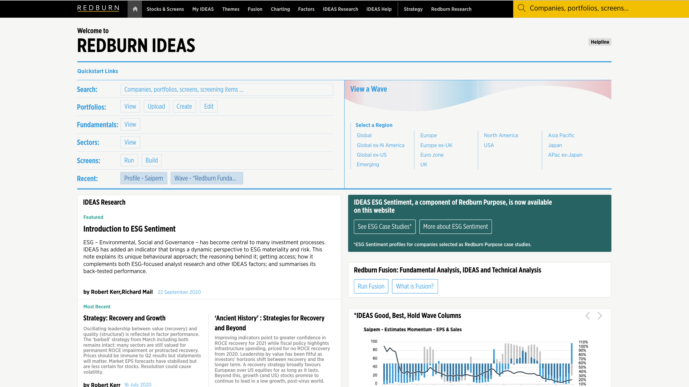
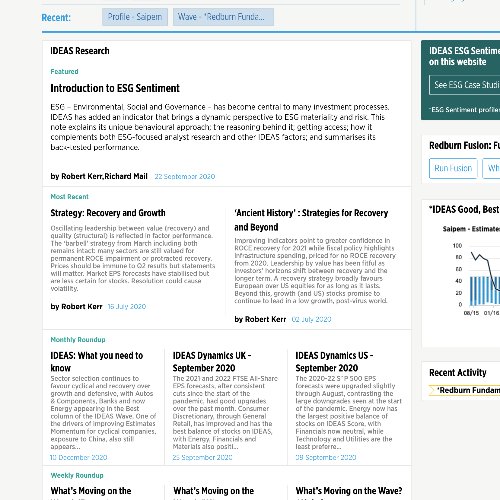
Existing homepage
Updated homepage
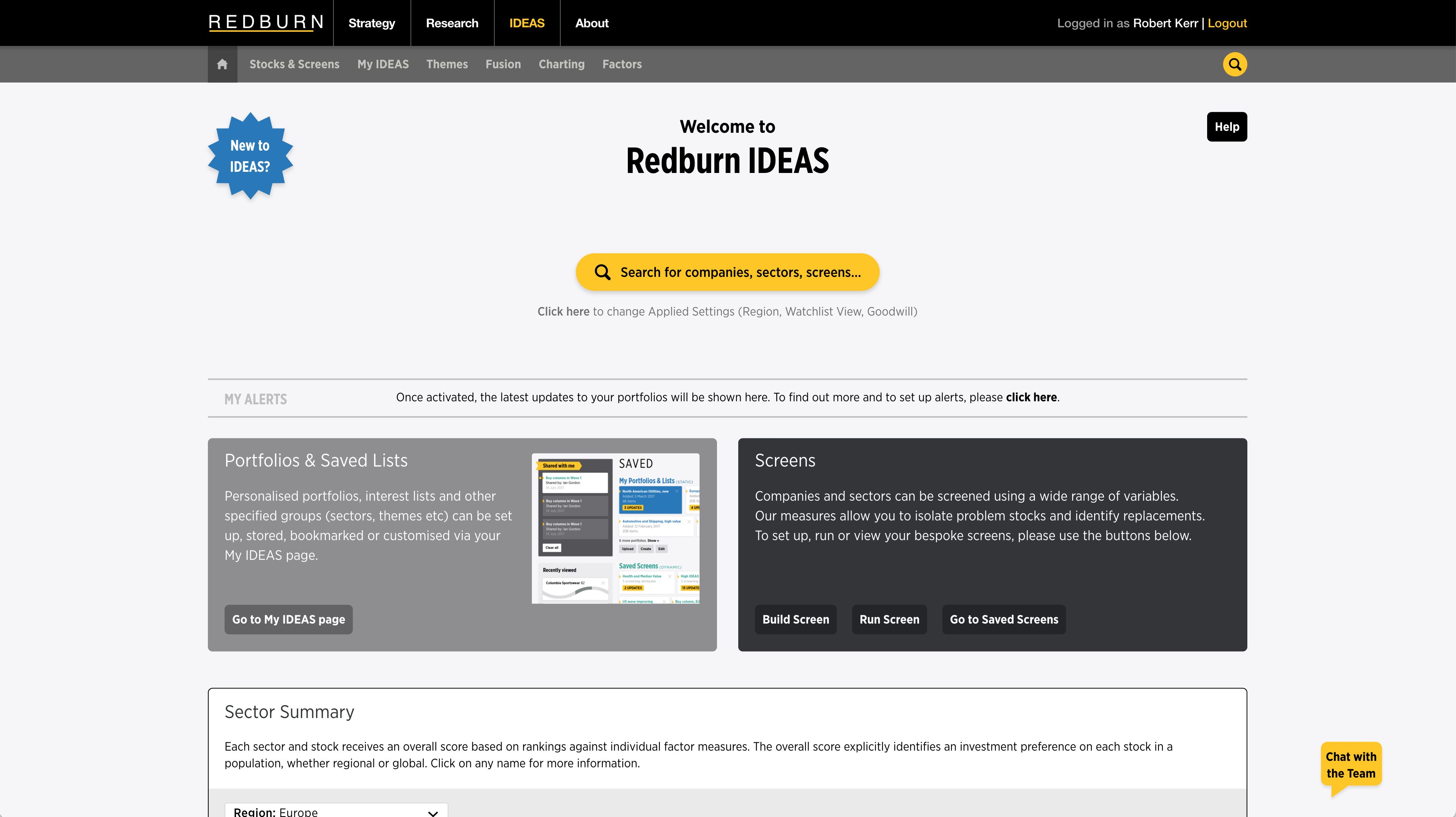
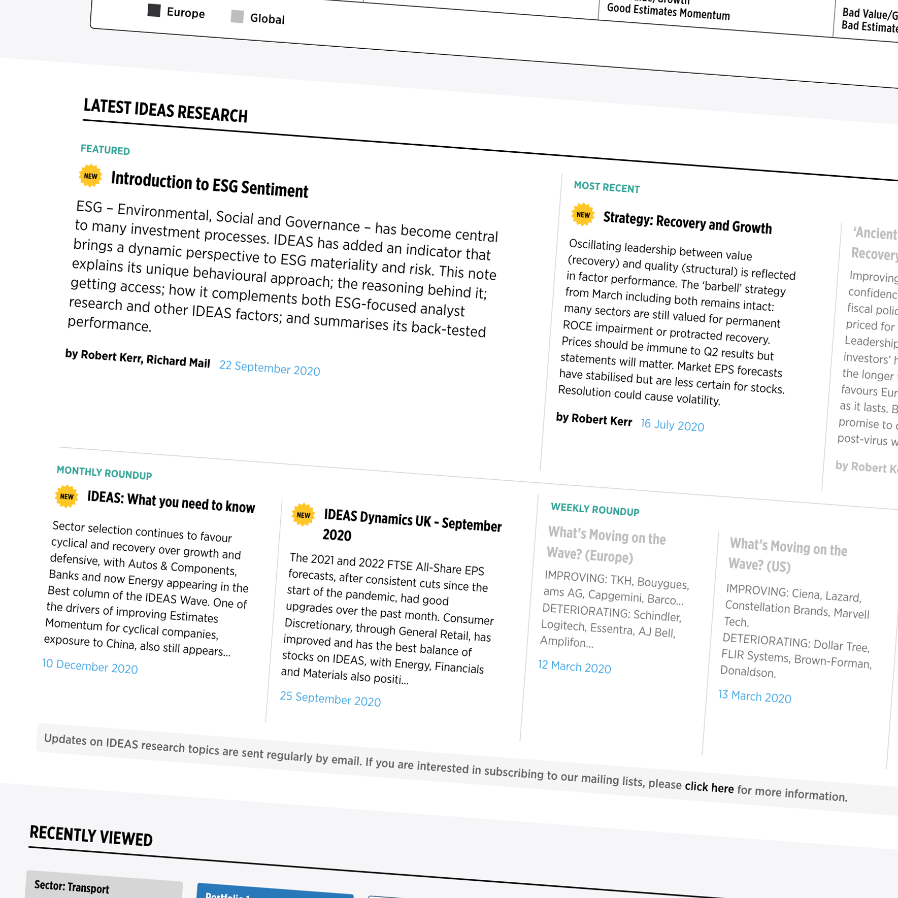
Amendments focused on a range of ways to improve usability, such as increasing font sizes, enlarging white space and using labels to indicate 'new' content (original page on the left, new design on the right).
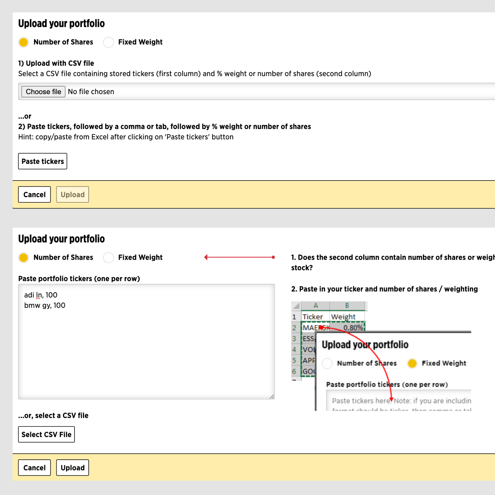
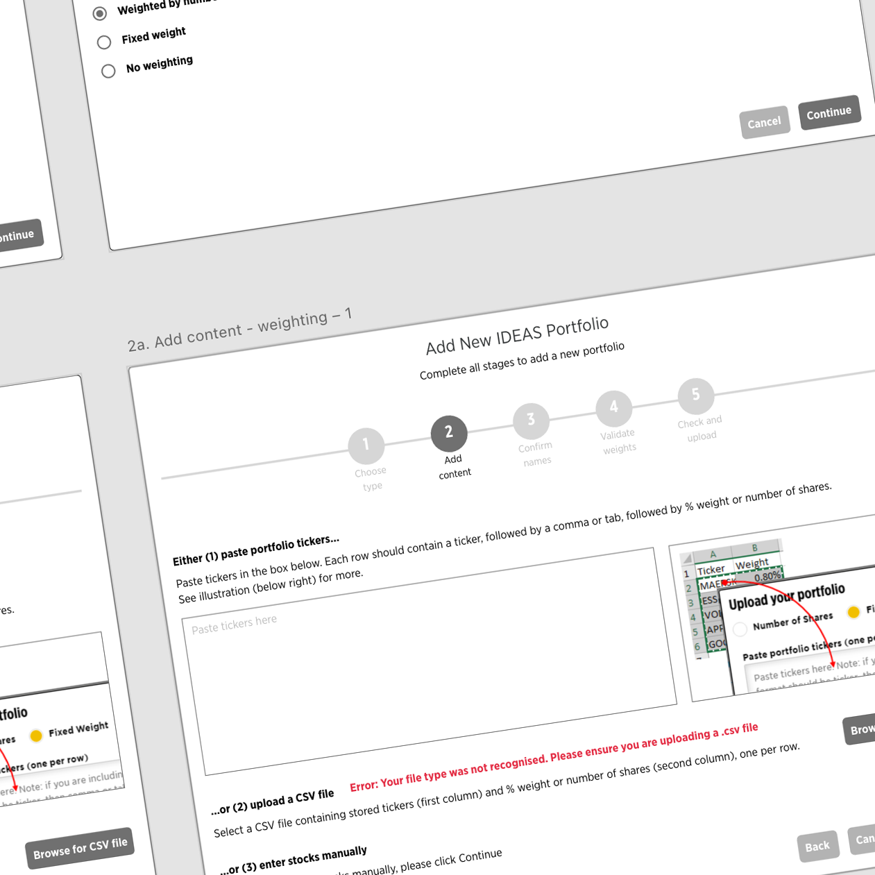
We also looked at improving user flows for the portfolio update widget by adding breadcrumbing, clarifying the difference between active and passive buttons and providing better feedback messaging (original on the left, new design on the right).
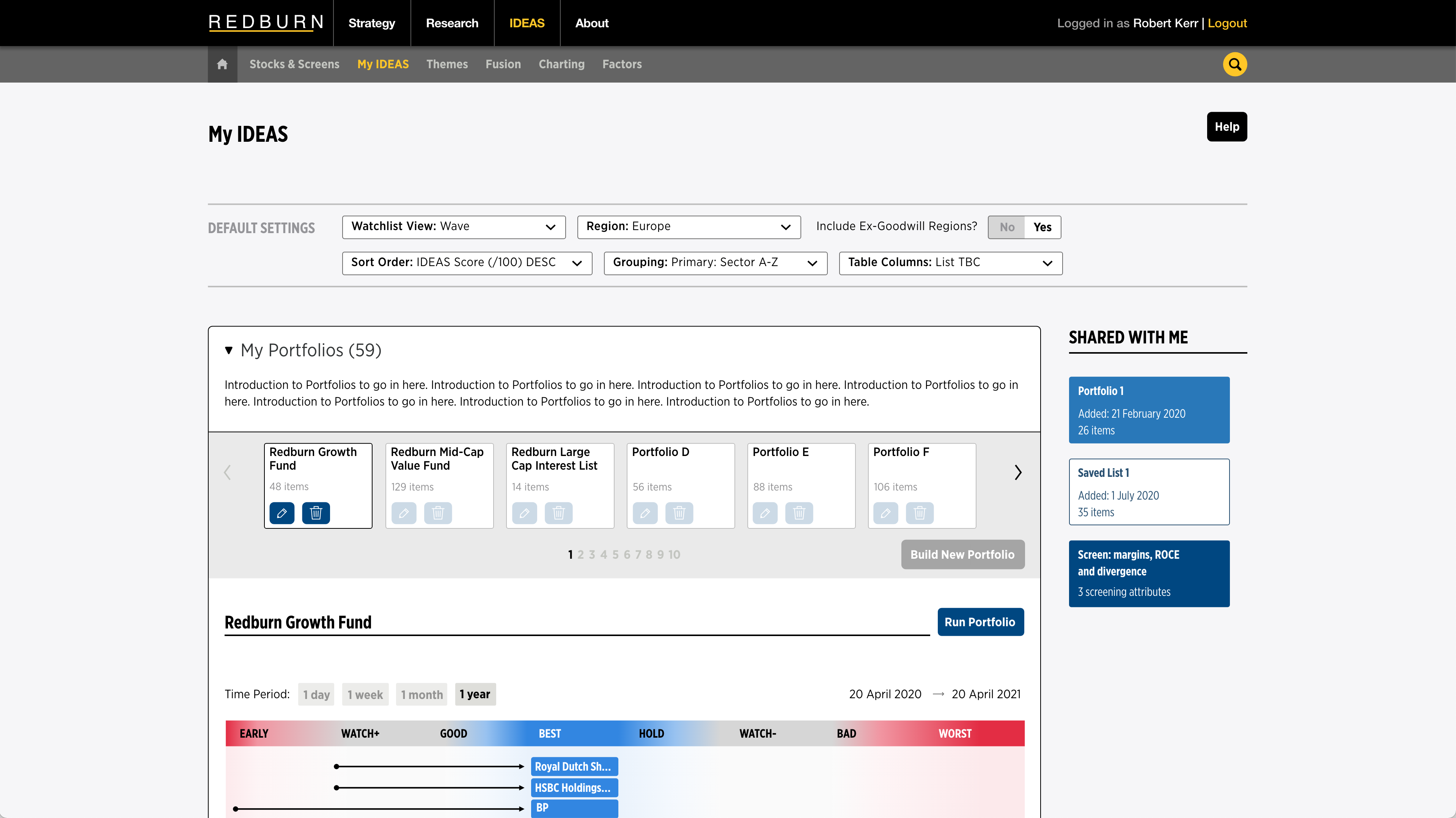
Finally, we looked at possible improvements to the 'MyIDEAS' page. Previously simply a functional page to control saved items, the new page will include simpler settings and better visualisations of saved items.
Existing MyIDEAS page
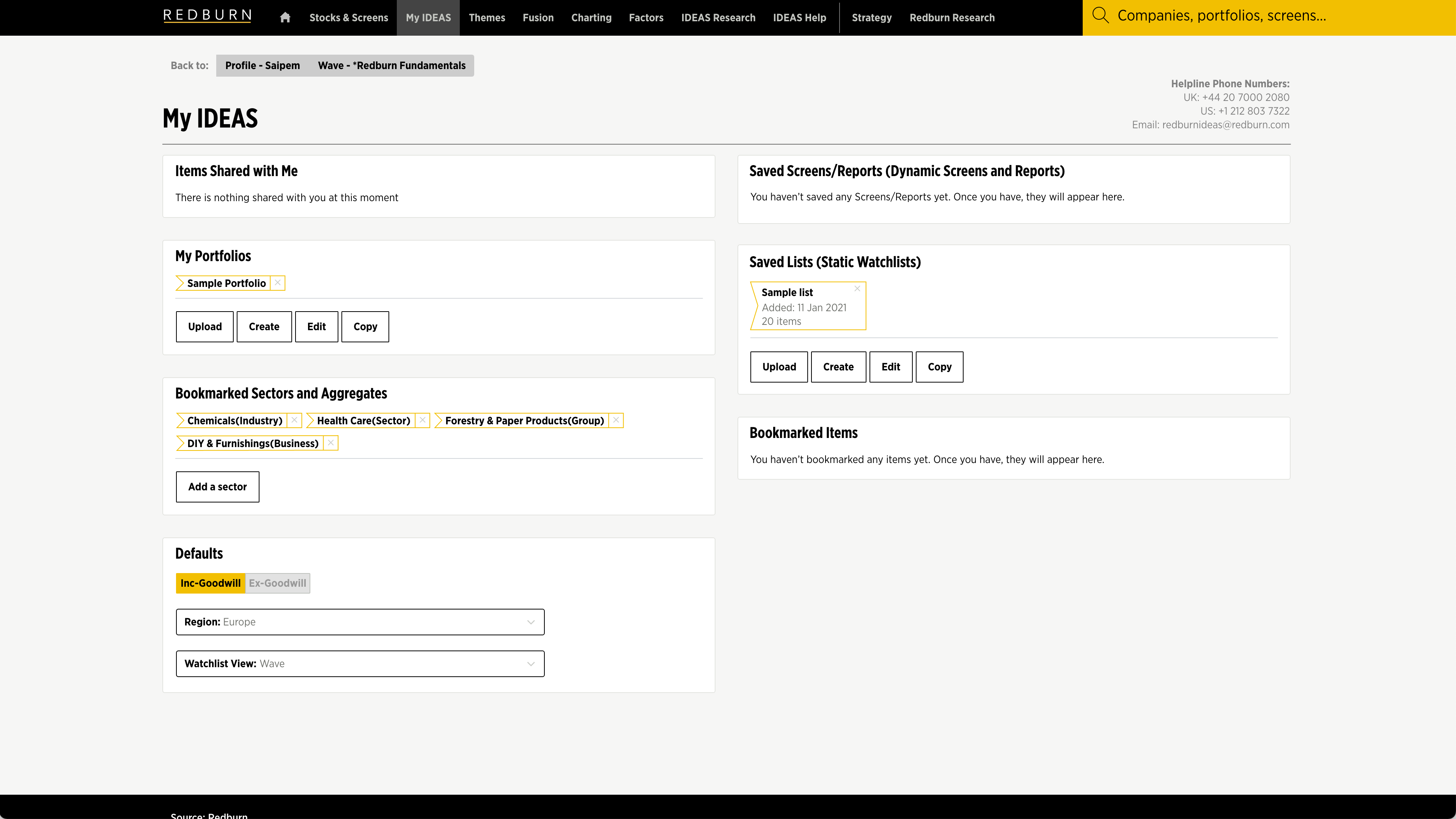
Proposal for new MyIDEAS page
