Building a User-Curated News Feed
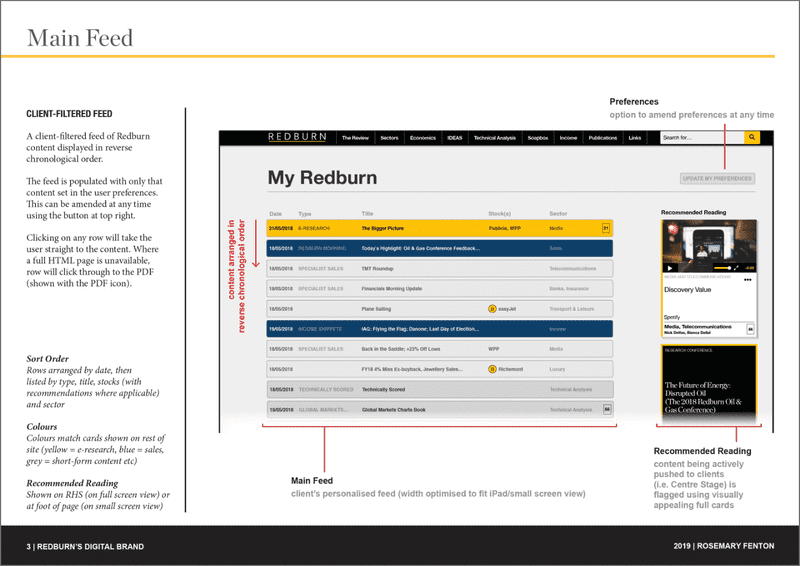
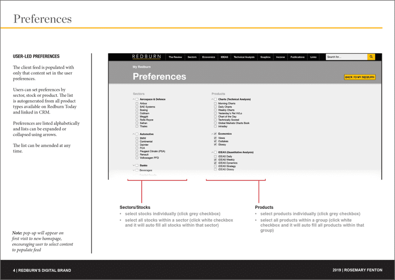
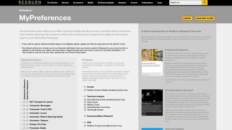
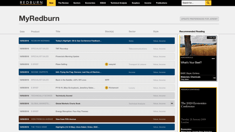
Brief: The homepage of Redburn’s research website showcases all the latest research published daily by all teams at the company. However, this can mean the content a client is actually interested in gets lost among the noise. I was tasked with designing a process by which a client’s email preferences could be used to filter content on their homepage, creating a feed personalised to each client and editable by them at any time through a simple interface.

Initial designs focusing on basic functionality were tested with users to ensure they worked in principle.


In discussion with the heads of Sales and the business development team, we added descriptions of each department and a point of contact for those with queries. We also added tooltips on hover so that clients could see what they were signing up for. I worked with the Editorial team to provide the text for each section. This led us to the final designs, which were then implemented by our engineering team.


Following the release of the new functionality, the CRM and Sales teams at Redburn noticed a significant decrease in requests from clients to update their preferences, with clients entering these choices themselves. In addition, subscribers for a key newsletter jumped from 350 to c1500 in the month following launch. A clip from the promotional explainer video I produced to accompany the launch can be viewed below.
Please note, this video has been shortened for copyright reasons.